Before my class arrived in Mexico this past March, I was lucky enough to have some time to myself at a friends place. This allowed me to draw a lot. I could go through my whole process, but I think drawing is the one thing I need to keep the creative juices flowing. I've learned over the years painting on location that what really matters is composition, creating a mood, and getting things down loosely, not being precious about anything.


Colour comes very easily to me. What I really need before teaching, is a period of time to explore ideas, shapes, composition. In this series I'm showing how I see the initial shapes, choose the proportions of my picture plane, composing, then add the smallest amount of detail, and value sketch. Lots of people don't love this phase, but it's actually the most important part of creating a painting. Concept, visualizing, and seeing if it works.

I like to give many examples of what I'm drawing, and then the value study. You can go back and forth and note the details in the photo that didn't make it into the value sketch. I'm a bit strict about identifying your darks, mediums and lights at this phase. that's really how you'll see if it works. It's too bad there are many terrible examples of "thumbnails, which more represent the mess in soemones' mind, rather than how the painting will look.


You can also tell how succesful the painting might be from yoru initial response to seeing each value study, know as a notan, or a thumbnail. I like to call it a value study because that is what your thumbnail should be. A drawing that tells you where your darks, mediums, and lights should go. The viewer should be able to see and figure out what the painting is about in a split second.


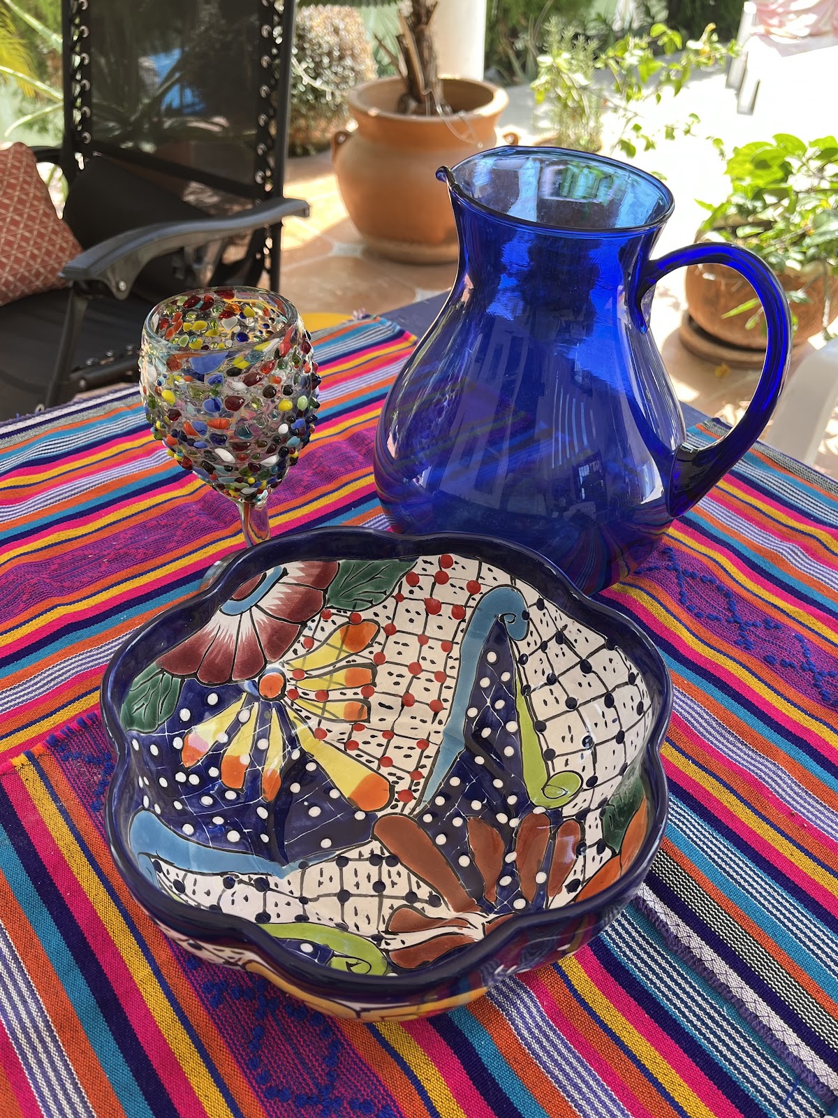
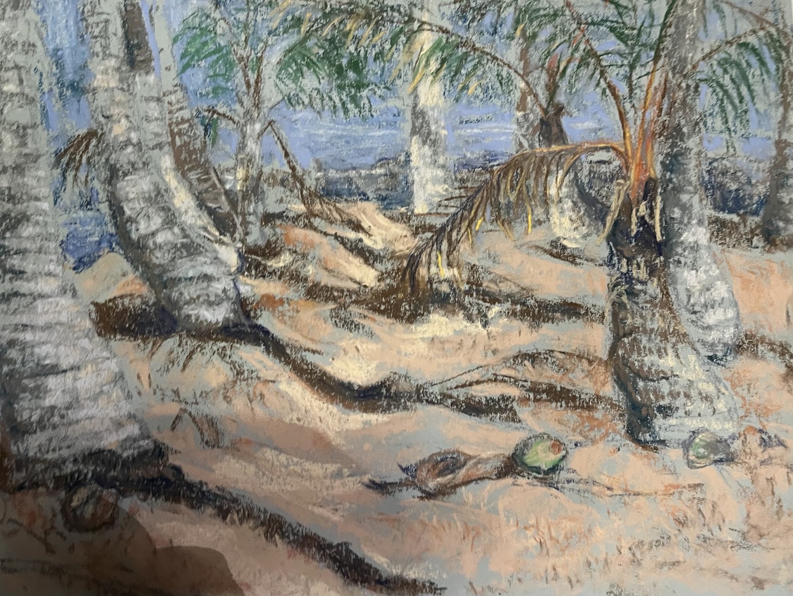
I loved the two tones on this stucco exterior, so typical of many Mexican homes to be painted in a lively intense colour, the subtle shadows, and placement of leaves and petals. I loved the drawing. The colour version is also small, I consider that a "field sketch" meaning a small piece in colour to see how the composition in colour would work in a painting. If it doesn't work out at this stage, I've only used up a small amount of time trying it out. By working small, you can try out more ideas. Creative people are swimming in ideas for paintings all the time. This piece doesn't represent the colours accurately. One of the things that happens when travelling and painting. You must "make do" with the selection at hand. And not fuss too much over being too particular.
In my teaching life these days, I'm teaching more about creativity, working through ideas, and how to maintain your creative motivation. To stay in love with art. That's why, on this recent painting trip to Mexico, we spent time talking about ideas, organizing them. Which ideas are best painted on location, and which ones come back home by way of sketch and photo? We only have so much time on these trips, so photo opps with no painting does happen. Here are some ideas that worked, got done, or may be in the future.


Not only does honing your photography skills take the pressure off of painting everything while there, it is also a visual journal of sorts, a memoir to look back on and remember all the amazing things you saw while travelling. There are amazing things to paint everywhere, you never have to go far from home, if you know how to compose. What you do get from my trips is some guidance, the pleasure of travelling with many other like minded people, and the sharing of our creative spirit. It's just something you can't top, coming together under the umbrella of our love of art.
Stay tuned for an announcement about my next trip, exotic, exciting, with a distinct culture.
Cheers, Margaret


