Tuesday 4 October 2022

Completing the Circle A creative journey of a life time.


Spontaneous Combustion, 36" X 72", tryptych, oil

Throughout my artistic life, from the time I was a young adult, I craved to find the center of my heart, my truth and my passion,...through art. Looking at great art took my breath away and I wondered if I would be able to ever make incredibly beautiful art, as others had done before me. Would I ever create art that took someones' breath away?

In this time of copying photographs, competitions and the pressure to be "successful" (whatever that means?!?-that's another blog post), how can my only reason for painting be to take someones' breath away? It's so easy to be swept away by the pressures of promotion. 

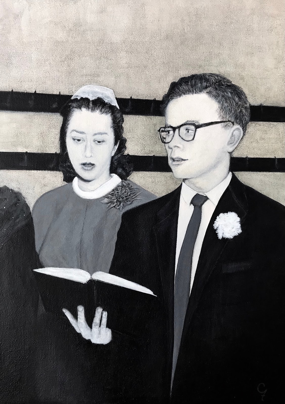
I've had some personal and professional goals that I wanted to accomplish in my lifetime. It's been the reality of life to put other peoples' needs ahead of your own. I have no regrets -- Mom, girls. While running around in life for others', my imagination would run wild, thinking up all the ways I could take my own breath away, creating beauty. 

I did have the choice to not teach, and just get really ambitious with my painting, but that would have been so much pressure, and let's face it, many people will agree -- Once you start selling your artwork and working with galleries or even just the buying public, the pressure to sell can change who you are and what you say in your art. 

So I could be angry that it's taken this long to realize the dream,.. but it's been happening,...slowly,...for a very long time. It's hard to say I've finally landed, at the tender age of 62. 

This spring was a very busy challenging time. I'm still renovating my house. This year, I painted the exterior (stucco!-not easy!), parged the retaining wall and foundation, and much more! Teaching, public art commissions, and private art commissions all kept me hopping til the end of July.  Then life took a turn and I began a journey into landscape that I had been planning for a long time. 

Spontaneous Combustion,...a starting place. 

I've always been turned on by mosaic, geometry, math, and their place within art. So splitting the picture plane arbitrarily, based more on intuition and less on logic was a very new place for me to go. 

These 4 girls were found at the local public pier in Shanty bay. They were having a ball jumping into the water together. My thing, painting the figure in unusual positions, them  all jumping together. magic! I am thrilled with how the water turned out and feel this expresses more about what I wanted to say, than a realistic painting. The colours create the excitement. 

It was kind of crazy, after not painting anything important for months, to start with a 18 square foot painting, but this is what my intuition was telling me to do. Over the years, I have learnt to trust my intuition. 

French River Rock, 22 X 28 $1350.00

The next piece I started was French River Rocks. I knew I wanted to  follow the contour lines that were in the rock, creating a division of the rockface. But it was what I did in the water that I feel was such an interesting contrast to the organic lines in the rock treatment. I was thrilled with the water when this happened and love the contrast between the rock and water. 

I've described the first two paintings in this series, which I am calling New Directions.  I'm closing the circle and completing the goals and dreams of a lifetime. I've created 12 new paintings in this series since the end of July, and have many other ideas of how I'll be extending other thoughts and creative ideas into future work.  Not too significant, eh?

I will continue to post more about this series,...after the open house and tour, this Thanksgiving weekend, 2022. See you on the other side! 
Margaret


Monday 6 June 2022

Avalon A tribute to my friend, Gaye Trombly


Avalon, 24" w X 36" h, pastel on sanded paper, 2022

I met Gaye in a pastel class several years ago. Her talent as an artist was right there, just under the surface. She had a light, jovial sense of humour, was great fun to be around and we connected on many levels in our respective philosophy of life. 

It wasn't long before I started accepting invitations to paint, and then teach also, at Avalon Orchards. Gaye bought this property to set up some type of farm, and discovered apples grew well in the area. Thus, Avalon was born, and it was a passionate endeavour for many years. With over 10,000 organic apple trees 
not only was this a going concern, but the view of these trees in their spring splendour of full bloom, was quite a heavenly sight to behold. I'm glad I got the chance to paint in this magical period on the farm a few times. 

Gayes' fairly sudden departure from this earth happened last November. She didn't see it coming, leaving her family and friends in dismay at th eloss. Last Sunday, May 30th, we gathered to pay our respects to a wonderful woman. People came from very far away to gain some closure and remember a witty, extremely intelligent, KIND, funny, and loving soul who gave out to so many. 

My painting Avalon is in tribute to Gaye, to remind us of what this type of person stands for. Love, and kindness. What better way to be reminded then through the beauty of nature that surrounds us all. 

Avalon will be on exhibit at the Neilsen Park creative center in Etobicoke, from now til June 18nth. It will then be on exhibit at the McMichael Canadian Art Collection over the summer, before it travels to its forever home.  


Monday 25 April 2022

Everyday Sacred

My first foray into independent online learning began this winter with two advanced classes of pastellists, working indepenently on their own individual ideas and artworks, in an open studio setting. 
My job was to guide these artists to notice the frequency of their concepts/ideas for painting, to document them, organize them, and most importantly, to prioritize, let the best ones, rise to the surface. 

Many years ago, a student of mine from Tennessee gifted me this book, Everyday Sacred (thank you Suzy and Curtis). I knew, at some point, that I would design a course around this book. The concept is philisophically elemental for artists. To pay attention to our everyday lives, and find the sacred in the most familiar, seemingly average days. To find sacred, in the seemingly, at first glance, ordinary. It's all in your state of mind.

One of my jobs is to expose my students to excellent examples of great artworks, born fo great ideas. So we took the time to study and search out artwork by other makers. First, I would create slide shows based on a theme. It could be colour treatment, or subject matter. The following week, each student had to provide an example for another slide show to be shared with everyone.  

It's all about pooling ideas, and developing your own taste. Finding your direction and style in art is as simple as asking oneself whether you like something or not. Over the many years I have taught, I've noticed that students often don't take the time to simply appreciate the work of others. We have no excuse, everything is at our fingertips with the internet. 

I gathered students from Florida to B.C. , one of the great things about online classes, no geographical boundaries. We did this at night for members of the workforce and in the afternoon for my retirees.  
This was not a beginner class, you had to have some experience, in order to feel comfortable working on your own. I do have a process I teahc my students, so they know how to take an idea, create a thumbnail, choose a pallette and have some understanding of composition. 

For many years now, I've been involved in helping my students develop QUALITY ideas and themes in order to develop their voice in art. We talked a lot about working within a theme, but also bounced around a lot with different subject matter. I really enjoyed quite a lot of discussion on winter landscape, but we also delved into flowers, still life, colour saturation, with much discussion on ground choice.

The results of these classes has astounded me. I am so friggin proud of my students! I've seen so much growth, and know that everyone has benefitted so much, from seeing and hearing about the work of the other people in their class. 

I would like to give a BIG thankyou to everyone who attended one of these classes, it has been my honour and privilige to teach you all. I look forward to doing it again. 


B.C. flowers from Janets' garden.

 
Kathys' careful apples.


One of many of Vals' beaches. 


Miriams' original ideas of shape and placement. 


Cindy find the sacred in everyday


Gillians' theme of tulips - a graphic and personal approach


Risk taker Mikkis' Cottage life is sacred.


Audrey captures the mood.


Jennys' love of nature  


Margos' theme, of this sacred plate.


Leilahs' patience has won


Cates' realism realized. 


Julies' lovely and loose Fawn Lily

Thankyou to all my stduents who attended these classes,a nd to those who sent in a piece for this blog post. 

If you work in pastel and have some knowledge and experience and are interested in working independently, in a safe and encouraging atmosphere with other pastellists, please be in touch. 
As always, thanks for listening, Margaret Ferraro.
To contact me about coming into the advanced pastel program, send an e-mail to marg.ferraro@gmail.com


Monday 21 March 2022

Underpainting: so many choices! No right or wrongs, just different effects.

Swing! oil, 20"h X 40"w, with red underpainting, also oil. 

Many years ago, a student gave me a wonderful photo of her daughter swinging. It's just my kind of thing. The figure, in a challenging position, giving the effect of huge fun, full of colour and play. Like many artists, I have a huge collection of images, and sometimes it just takes a lot of time to get to them all. 
So I thought I'd give a little explanation of what happened here, in the evolution of what if? with this image. 
It all started with the large amount of intense and varied greens, everything on the spectrum from blue greens to yellow greens. I've noticed in my extensive work as a plein air painter, that you need a few tricks when working with greenery. This was a studio piece, but plein air informs studio work. I think of plein air as the training and foundation. Plein air gives you spontoneity, easy light choices, and opportunity to try things and learn. From this learning, came the idea of making an underpainting in reds. Warm red at the upper left (cad red medium), fading to cool and darker red, lower right (alizaron crimson). 
What I've observed in past paintings, is that by contrasting pure reds against a host of greens, I can add a lot of fullness and colour harmony to the overall effect, which I thoroughly enjoy. Also, with the structure in place, it's very easy for me to add a little blue and purple in the lower right, and a few different yellows in the upper left. A rainbow of pure pallette. 
 

Swing!, pastel, 12" h X 24"w, with raw sienna underpainting, in oil, on Uart 400 sanded pastel paper. 

This was a demo piece I had the pleasure of painting for SOYRA and RHGA on March 10nth. We didn't quite have enough time to finish, so I promised more images as the piece progressed. The medium is different, (pastel), but the underpainting is quite different. In my work in underpainting, Many students read an artcile that outlines one artists method for creating an underpainting-You know all thos DIY art mags? They are very informative, I'm not knocking them, but there are SOOO many approaches to underpainting, and no right answer about how to do it, which colour it should be. There are no right and wrongs, just different effects created through different choices. 
With that in mind, I wanted to see what would happen with a much bright underpainting. Basically, the first one supports the value system already in place. The 2nd one contrasts against the value system, creating a light overall appearance. Making the light areas more prominent. In fact, when I wrote this, I hadn't included all the lights I wanted and feel the second piece could go much lighter. That's one of the reasons I wanted to try it. Although I do like the intensity of the oil painting, I wondered what the image would look like in a much lighter value range. 
I thought by presenting the two pieces this way, you can observe the different effects. Now, it's just up to me to decide which one is more in tune with my original idea and inspiration.